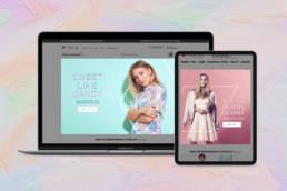
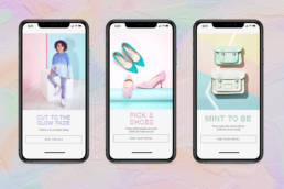
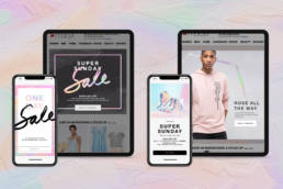
Pastel Prism
I was asked to explore ideas for campaign executions based on the trend “Pastel Prism.” The goal was to see how a seasonal theme could be applied across all FOBs using a chosen set of colors, textures, materials and graphic elements.
ClientMacy'sRoleArt Direction, Design, IllustrationYear2019CopywriterAdrienne Heller
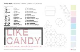
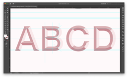
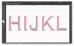
Typography
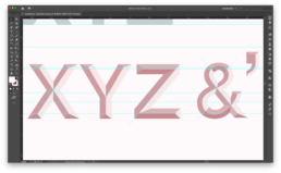
During the course of the exploration, I developed a type treatment specific to "Pastel Prism." To stay consistent with the existing Macy's brand, Helvetica Neue was the typeface used as the starting point.
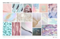
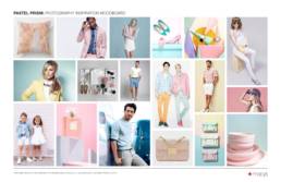
Process
Moodboards for materials, texture and inspiration as well as product photography.